

Practical Wrapped in Vintage Modern.
Art Director: Efren Baria Jr.
Graphic Designers: Caitlin McElroy, Sonya Clarry
Graphic Designers: Caitlin McElroy, Sonya Clarry
Photographed by: Brie Pointer
You’d think that brick & mortar travel agencies would be a thing of the past. But what makes Goliger’s Travel Plus so successful is its expertise and service of its travel consultants.
With that in mind, we wanted to level up the small customer details that (more than) contribute to the overall Goliger’s customer experience.
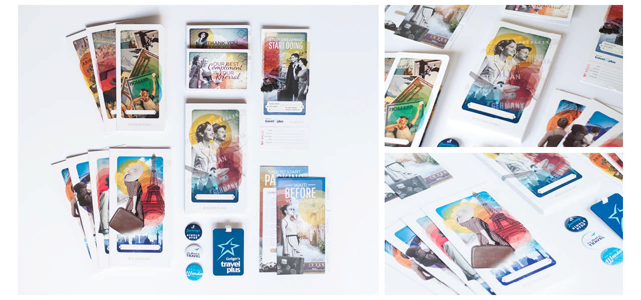
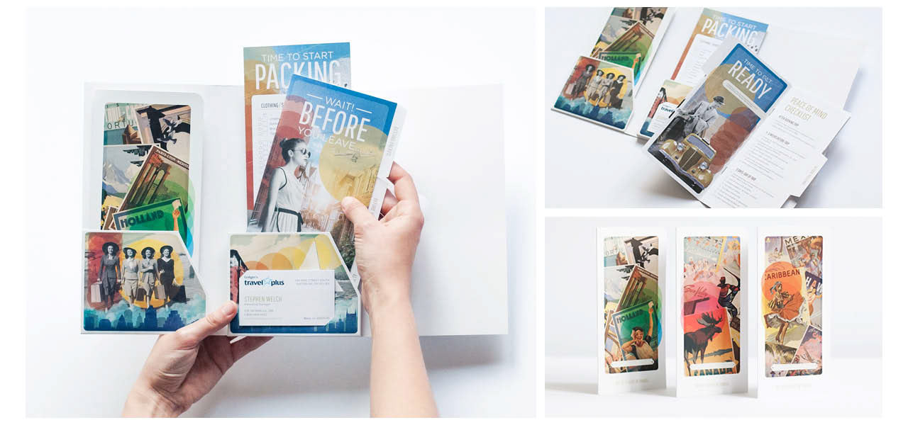
On a practical level, our costumers needed document holders (ticket jackets for those in the know) to properly contain folded printed sheets of their booking information as well as any other relevant travel info their consultant would have ready for them.
We designed 3 custom sized ticket folders that could be used in tandem with one another depending on the amount of documentation that was to be provided for the client(s). They were finished with a silk matte laminate finish on the outside.
To round out the package, we designed a small travel preparation guide and packing list on a smooth uncoated stock. It was a great complement to the ticket jacket it would be found in.
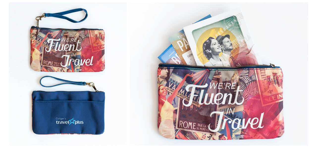
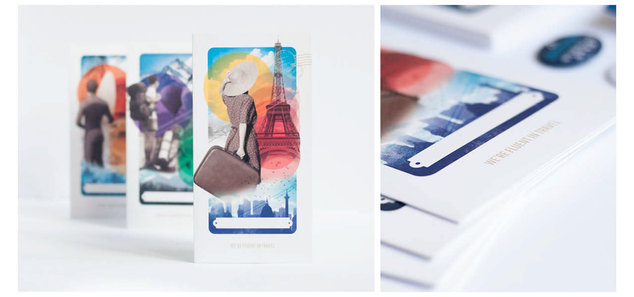
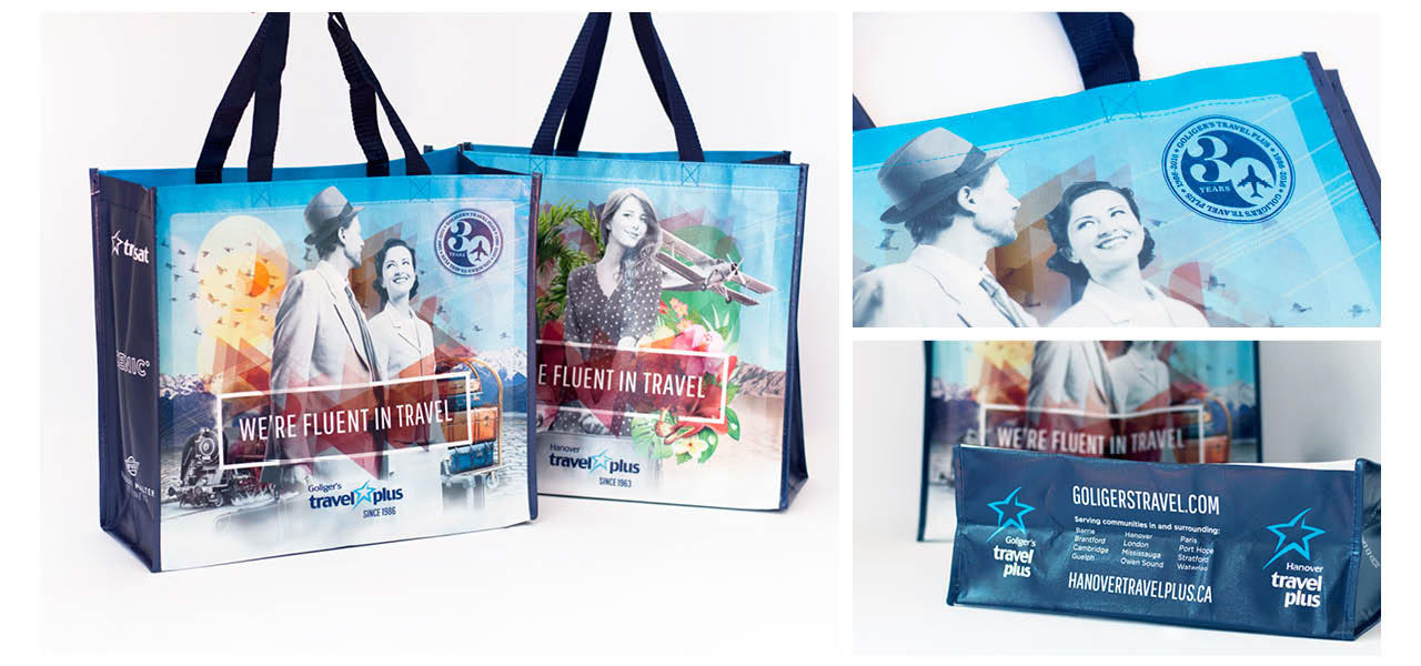
The visual design took nods from vintage style travel posters and a lot of inspiration from what they called “The Golden Age of Travel.” Back in the day, when travel started to become accessible, you would dress to the nines before boarding on a plane or a train. We paired it with modern elements and created a "collage" style because the Goliger's logo (which is under the strict branding guidelines of the Transat family) fell more on the contemporary side.
We integrated a lot of blues (to hark back to the Transat colours) to contrast the warm colours of the vintage posters and felt it had a great balance of new and old.
We integrated a lot of blues (to hark back to the Transat colours) to contrast the warm colours of the vintage posters and felt it had a great balance of new and old.
Overall, it resounded well with our targeted consumer of 50 years or older.
This visual style brought a morale boost to our consultants as they were proud to hand these packages to their clients.