
"The font needs to be bigger. Much bigger."
Art Direction: Efren Baria Jr.
Graphic Designer: Sonya Clarry (and Efren too!)
Photographed by: Brie Pointer
–
Website Design & Development: Him•Her
As a business... Bradley Walters Journeys is a homerun.
They're focusing on an entire segment of 65+ aged travellers who have humbly worked their entire life and saved their earnings to check off their travel bucket list. You can imagine that they want great service, and want to travel worry free.
As a rapidly growing part of the Goliger's Travel Plus family, and with the desire to grow this segment of the business, it made sense for me to propose that we level up the every aspect of the brand.
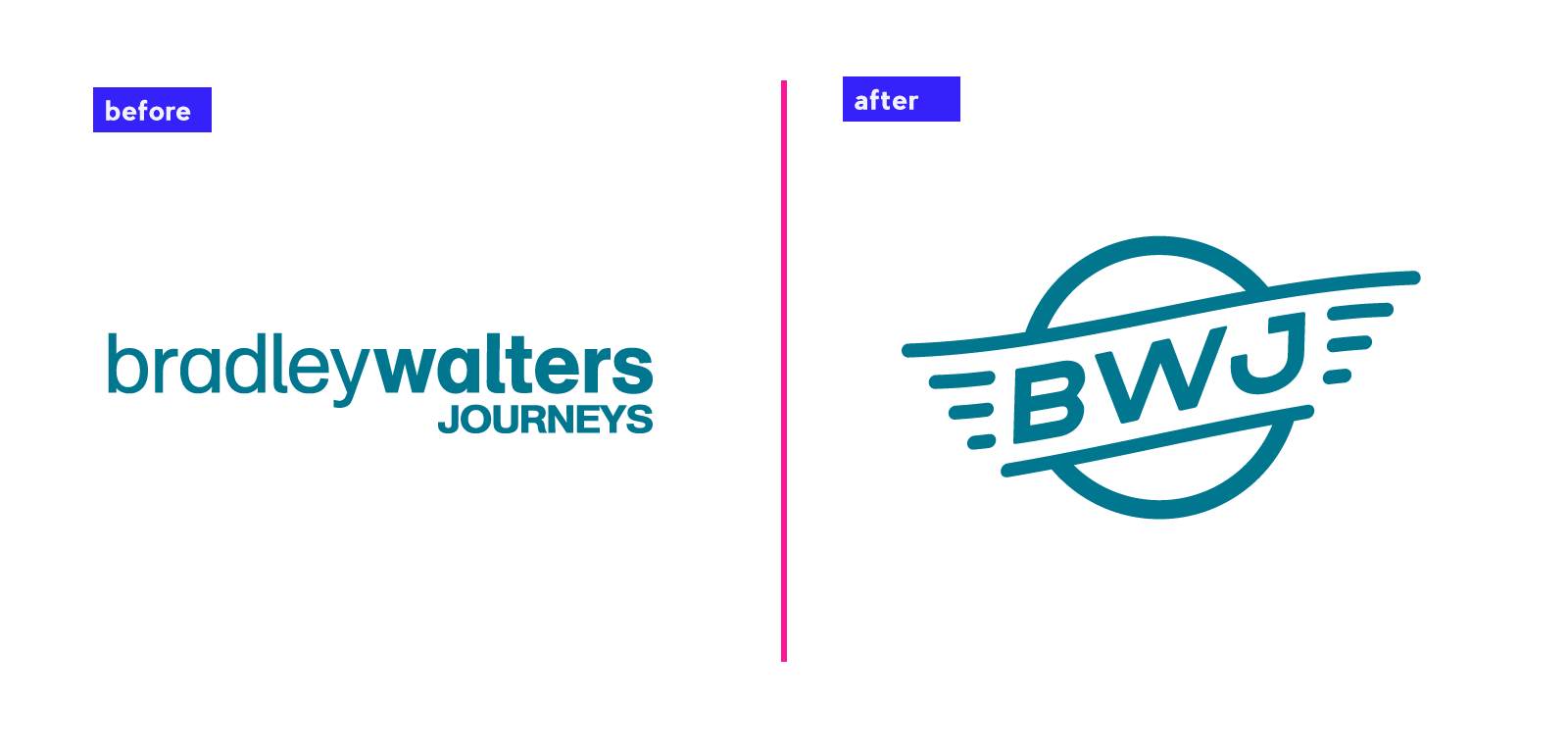
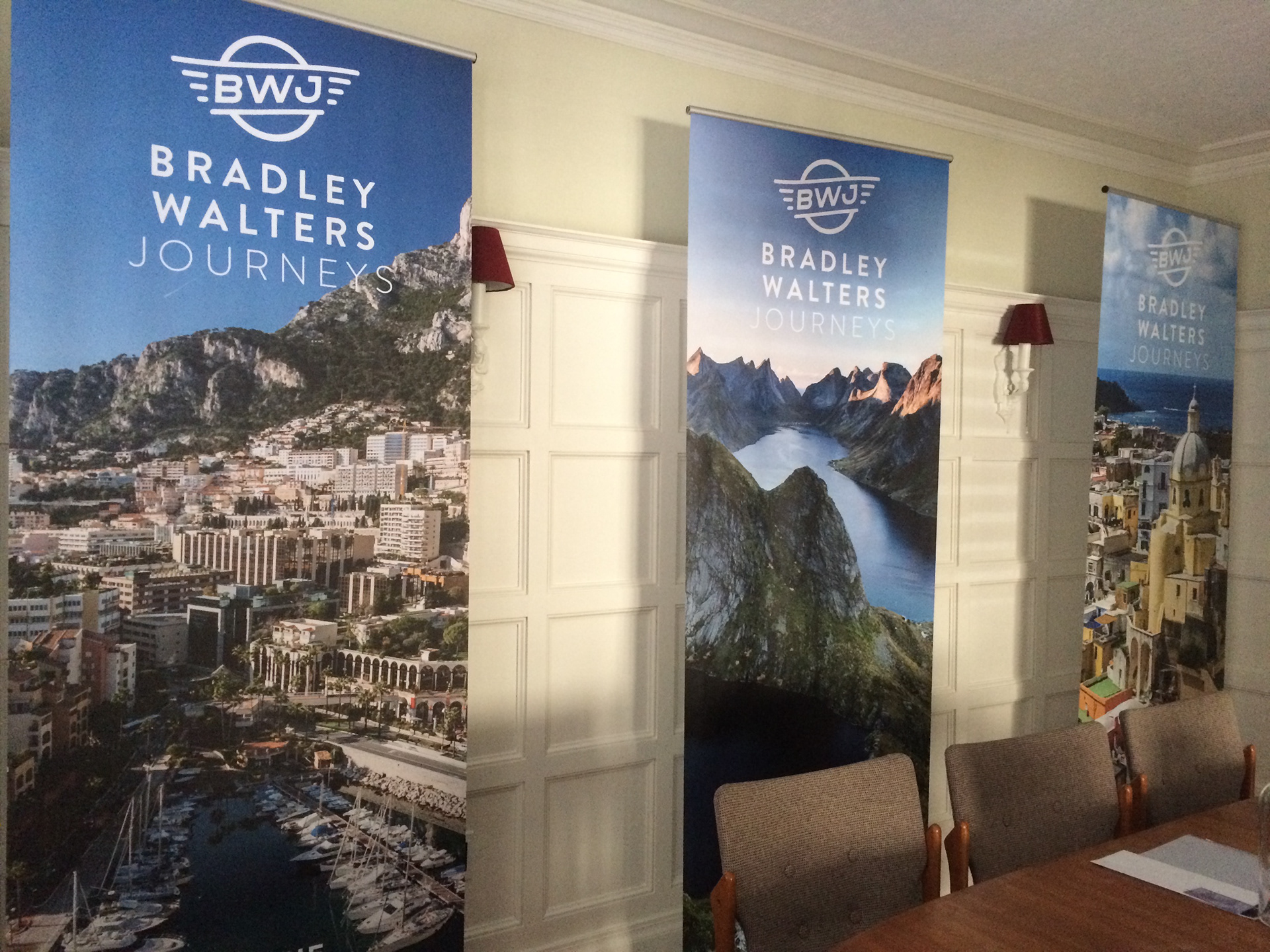
We started with revising the logo, which drew a lot of inspiration from car emblems and airplane logos that used wing and badge elements. Reminding our target market of the good ol' days was a definite goal in this project. There had to be some familiarity to connect them.
The logo mark needed to feel familiar, yet new. Super legible and versatile in it's possible usage. As we ended up throwing it on everything! Stickers, lanyards, signage, jackets, hats, cars... you name it we probably did it.
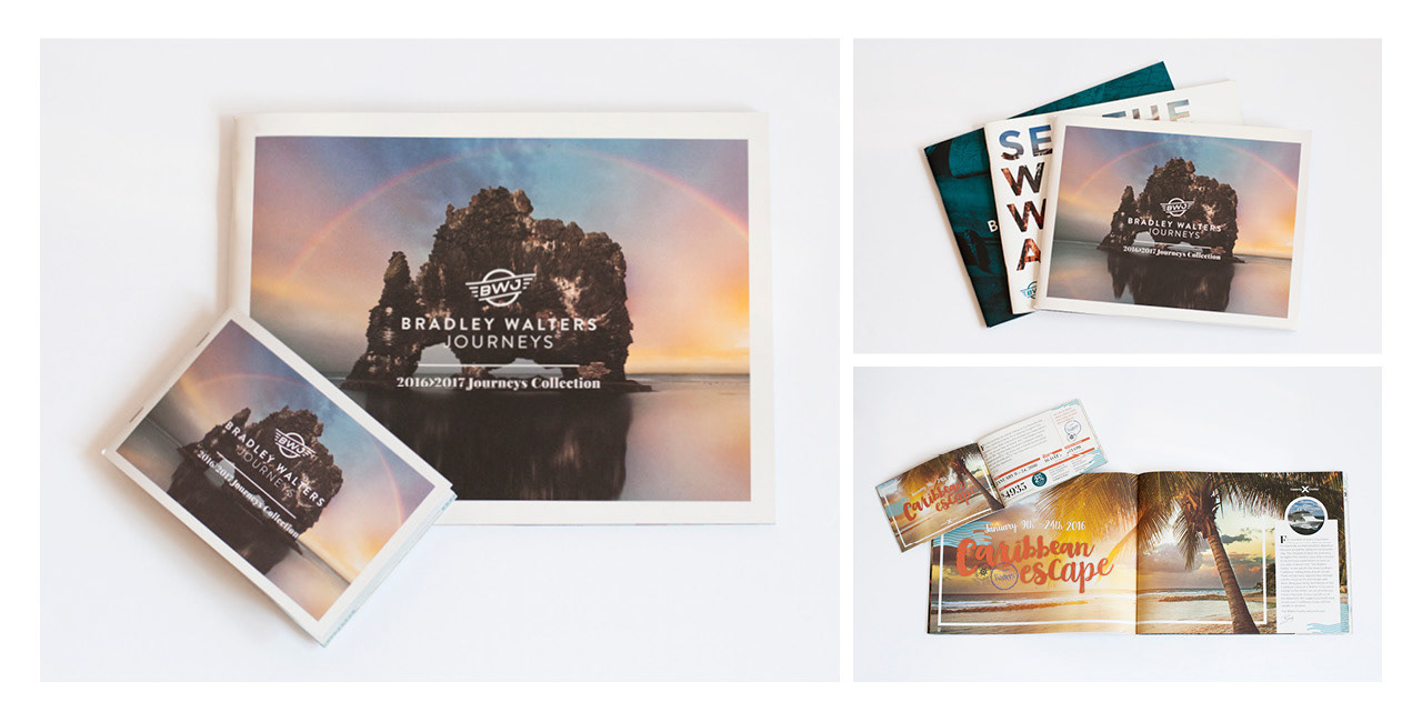
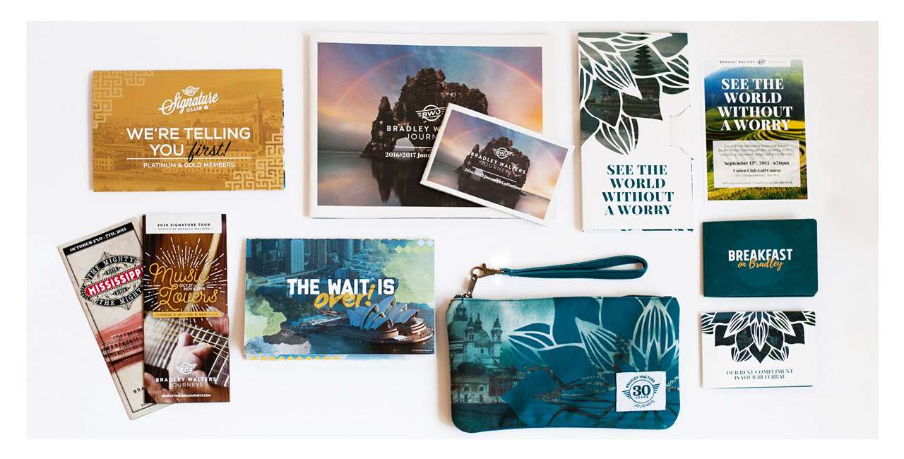
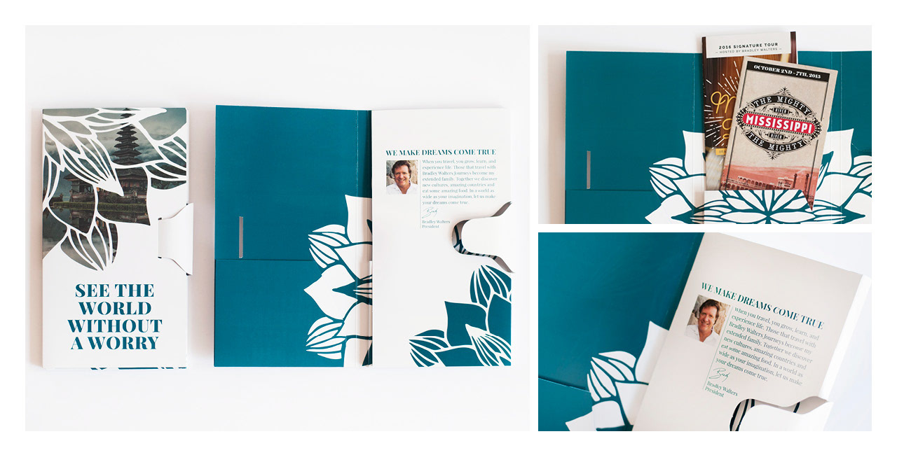
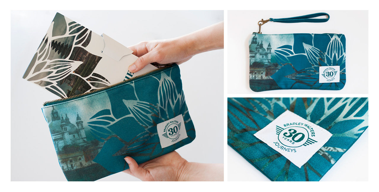
A major customer touchpoint for the BWJ brand was it's annual "Journeys Collection" – a catalogue of their upcoming travel adventures. This 65+ years were old school with regards to having something tangible that they could take home and read front to back to help.
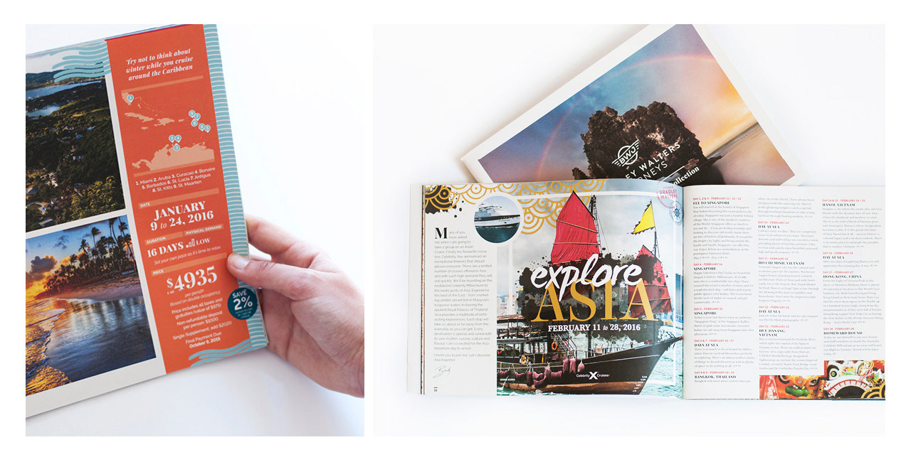
The brochures are a mix of style and function. They need to be visually dynamic,
but also user-friendly for travel agents and our clients. The sidebar is a key feature
on all itineraries that highlights the trip details in one place.
but also user-friendly for travel agents and our clients. The sidebar is a key feature
on all itineraries that highlights the trip details in one place.
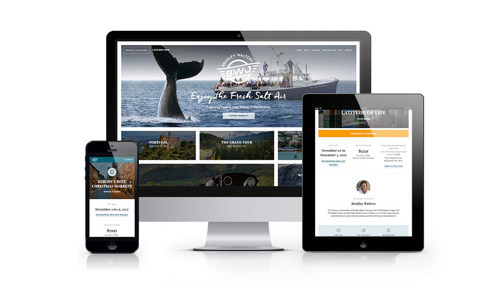
The redesign of the BWJ website (c/o of the amazing peeps at Him•Her Inc.) had the same considerations as the brochure. It had to be very easy to navigate through (like... insanely easy), typography and hierarchy had to be clear. Looking at our analytics from the previous design, the average Session Duration was around 5 minutes (which is crazy for any website!). People truly sat and read the content, so it was important to make the content comfortable to read, and information laid out very simply.
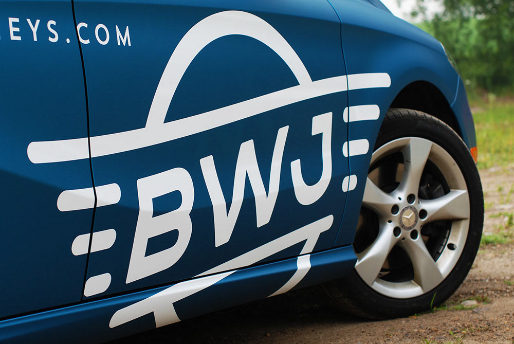
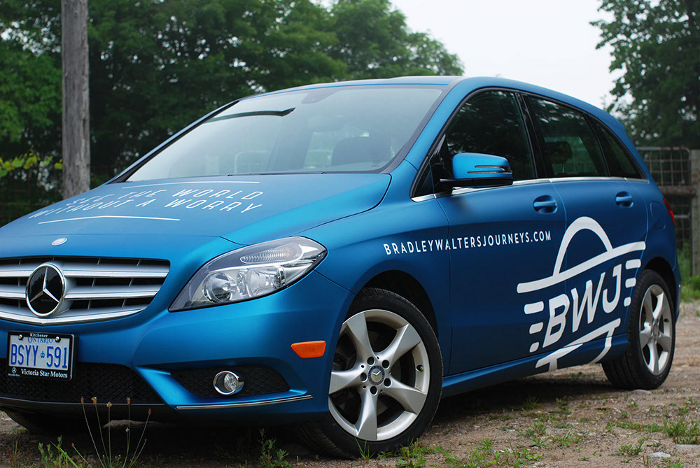
Car Wrap Photos courtesy of: ProWraps.ca